L’artisanal
Graphic design for a coffee shop
In 2024, I created illustrations and graphic design for a coffee shop called ‘L’artisanal’.
The story of this artisanal shop began in 1992 in the Saint-Josse neighbourhood of Brussels, when Amina and Said took over a coffee roastery in Saint-Josse. Based in Woluwe-Saint-Lambert since 2001, they offer a wide selection of speciality coffees and over 200 different teas. Their vision: “To transform your coffee break into an enriching sensory experience, creating a place where conviviality and good taste come together.” After more than 30 years in business, their son Abdelmatine, who has taken over the business, has decided to bring consistency to its brand identity in order to clarify its brand image and better convey its message.
Time Period
2024-2025
Mission
Branding
Packaging
Illustration
Kind of project
Freelance
Tools
Adobe Software
Brief and challenge
Objective: Over the years, the shop has tried out various graphic design approaches, which now lack consistency. The aim will be to harmonise all these graphic elements and create a new identity that conveys the values of L’artisanal: comfort, kindness and a warm, welcoming atmosphere.
Challenge: To create a distinctive brand identity that stands out in the highly competitive coffee sector, which is already saturated with high-quality brands. To achieve this, illustration will be a major asset.
Creative Process
01. Logotype
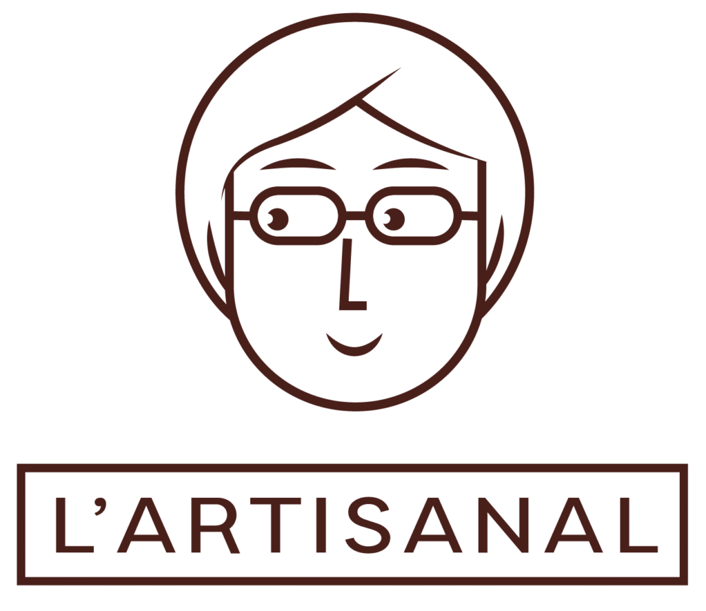
After much research, we opted for a logo that combines the classic elements of luxury with traditional design features such as a sans-serif typeface, in capital letters and of uniform weight. We added a frame to represent the stability and confidence that the brand must convey.

02. Mascot
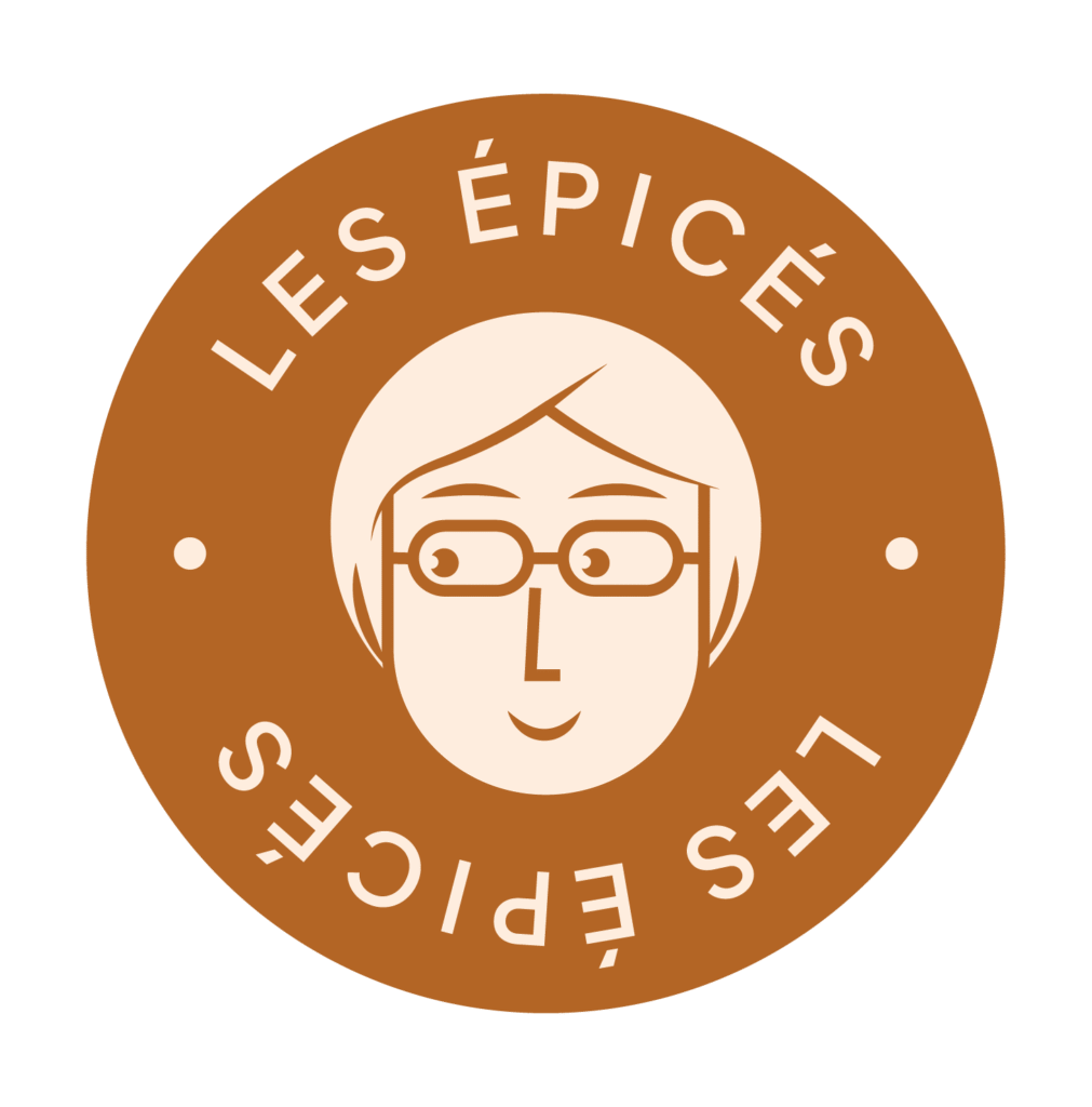
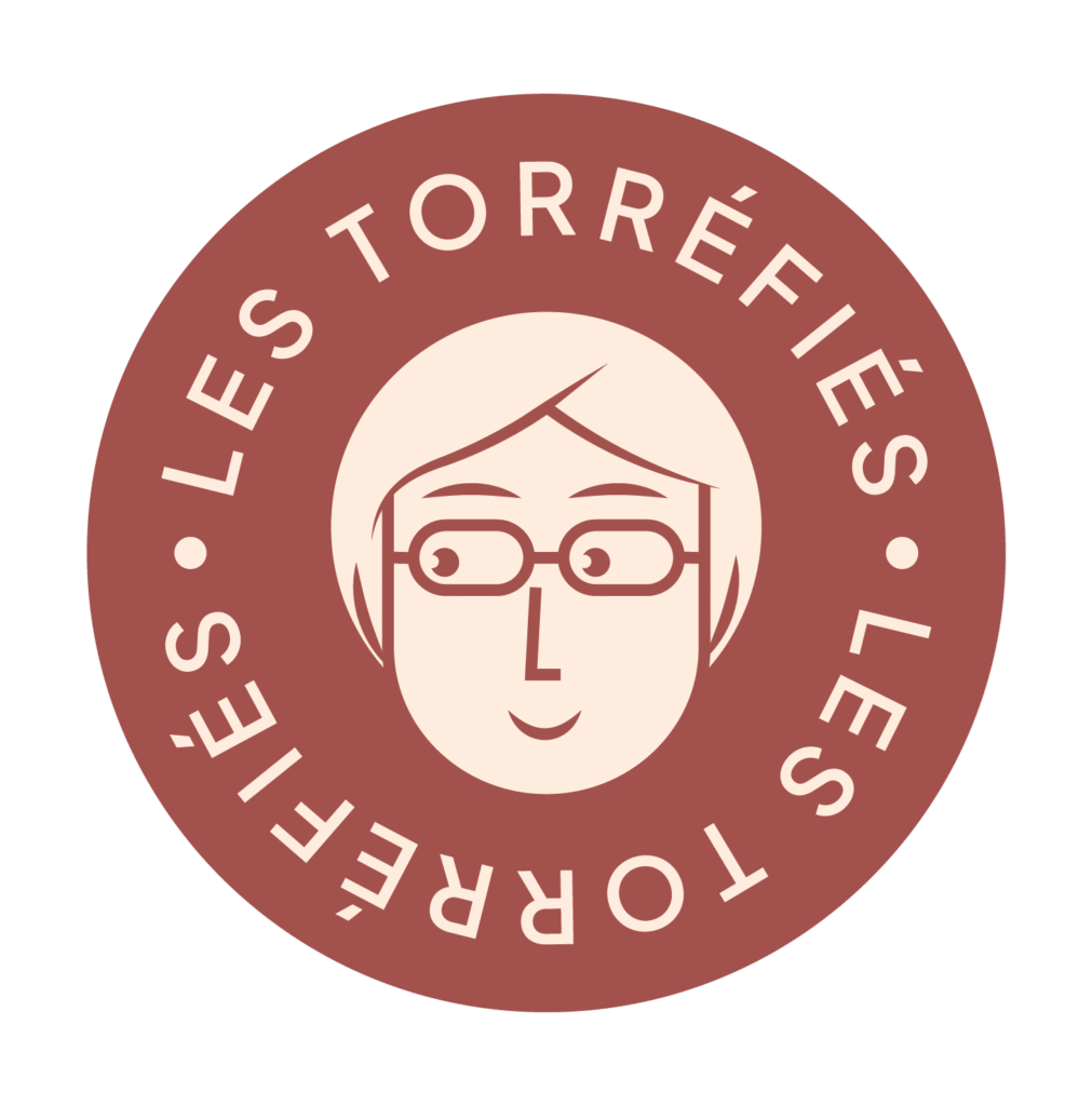
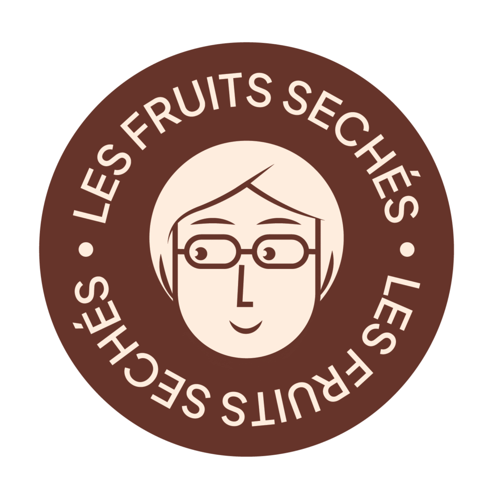
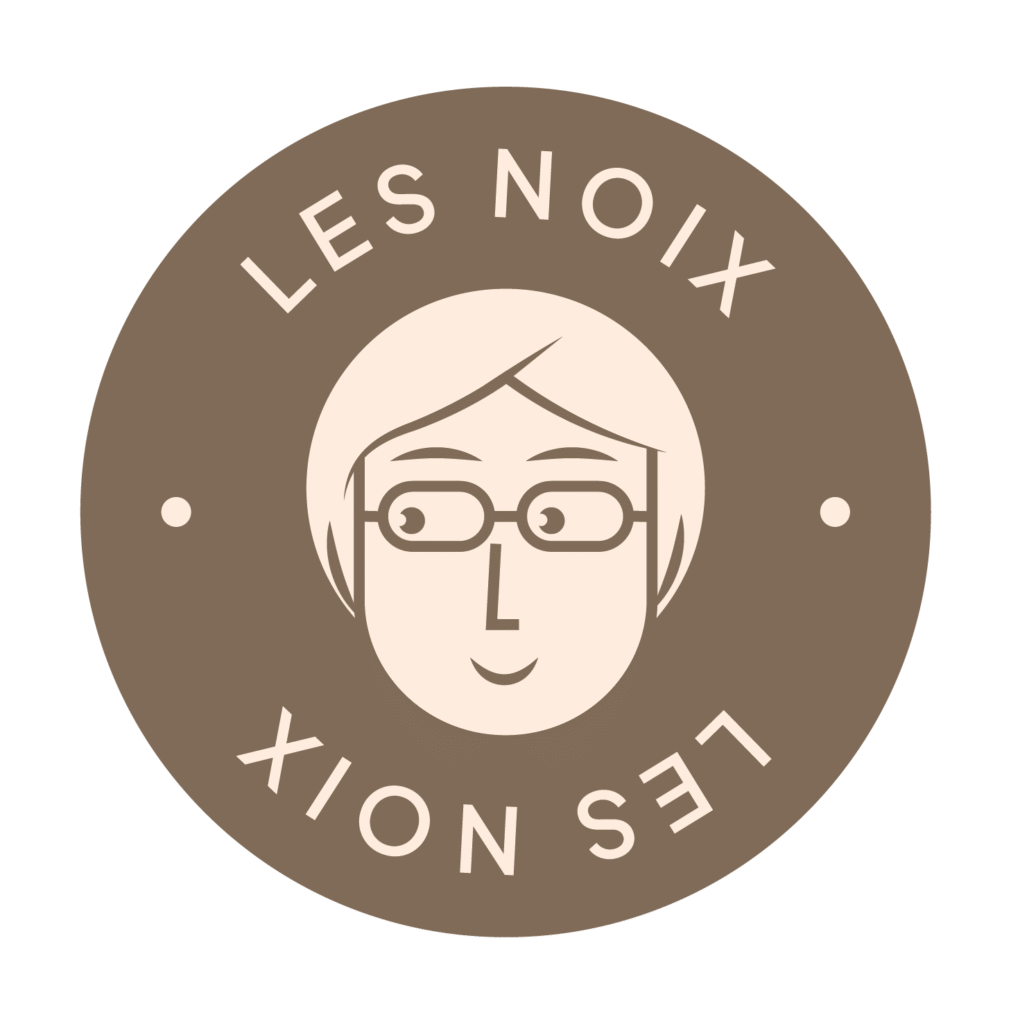
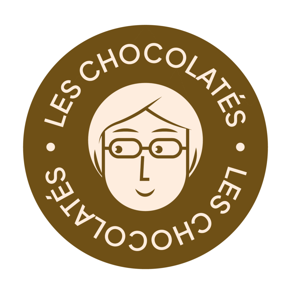
We decided to add a mascot to balance out the seriousness of the logo. This mascot represents Amina, Matine’s mother and former manager of L’artisanal. We opted for a balanced comic-book style. With her smile and sidelong glance, she watches over L’artisanal.

03. COLORS AND TYPOGRAPHY
We have decided to combine two typefaces:
IBM Plex Serif, which is more classic and traditional, evokes the world of traditional baking and emphasises the establishment’s expertise and long history.
Jakarta Sans, on the other hand, is modern and sans-serif, adding a touch of modernity.

Brown
Hexa : #491f1a
CMJN :0 58 64 71
A warm, classic brown reminiscent of coffee. We will then balance out this classic combination with bolder colours.
Beige
Hexa : #feeddf
CMJN : 0 7 12 0
A creamy beige that brings to mind the smoothness of warm milk. This beige will be used mainly as a background colour, complementing the white.
04. Visual universe
To illustrate the promotional materials, I am creating an illustration of Amina roasting coffee.
Flavour profiles
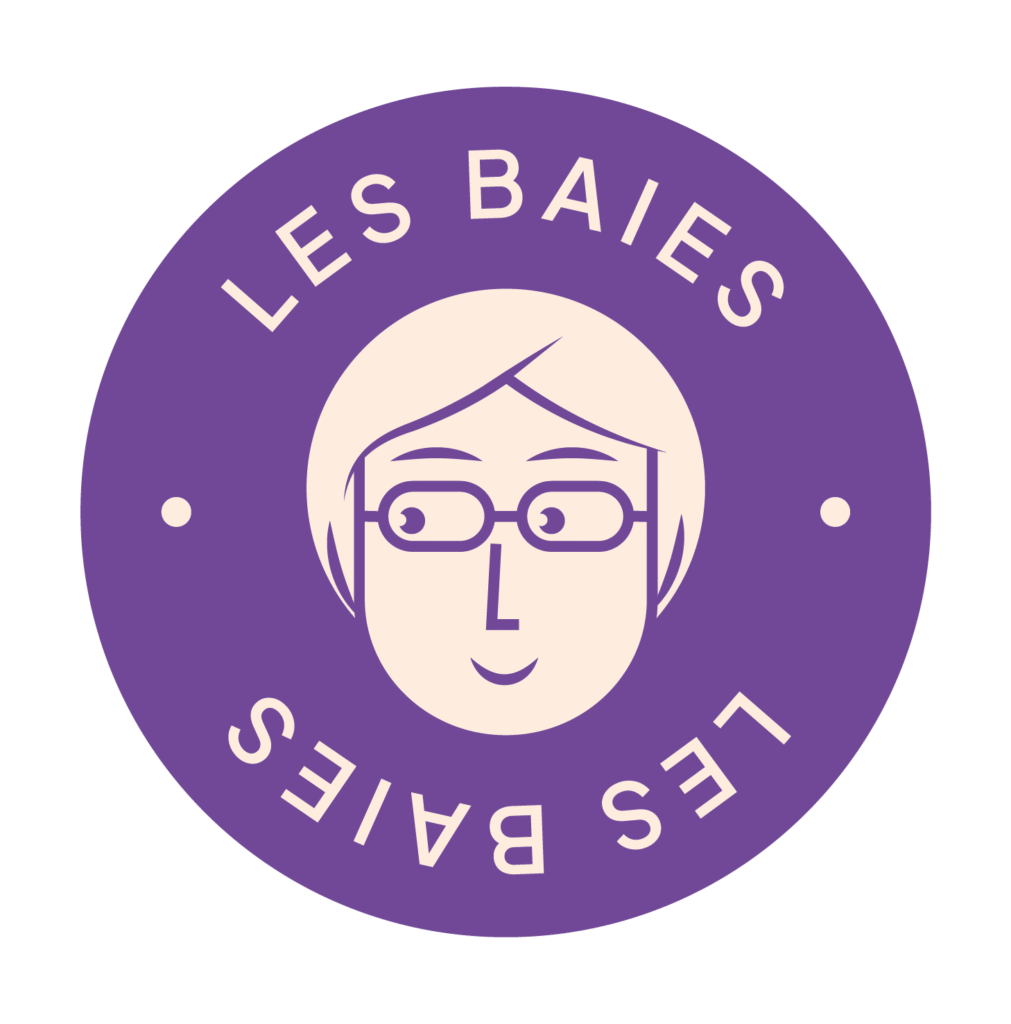
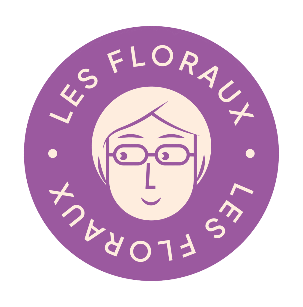
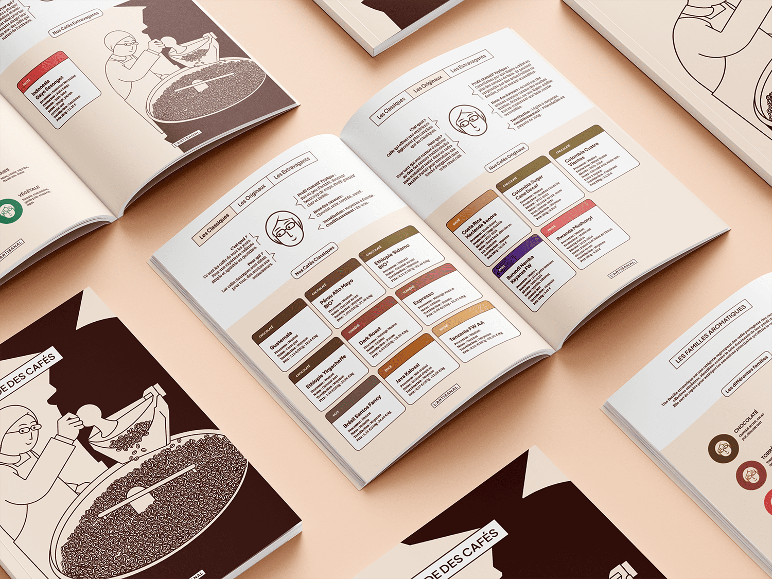
We categorise our coffees into flavour families, based on the coffee flavour wheel. This allows us to identify a variety of notes, such as berry, spicy or chocolatey. We have therefore chosen to assign a colour to each one to make them easier to identify. We can then adapt these colours for different purposes.



Graphics applications
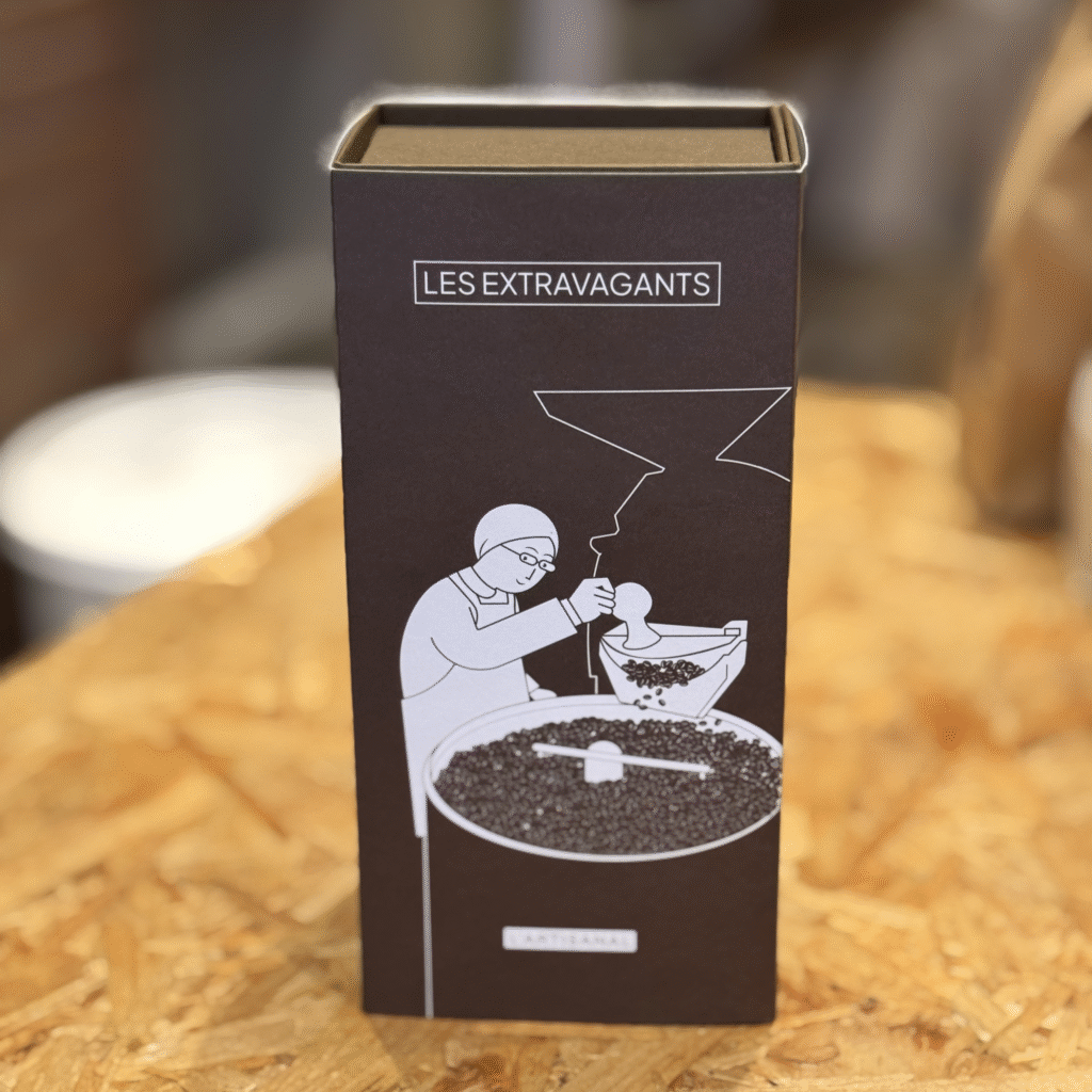

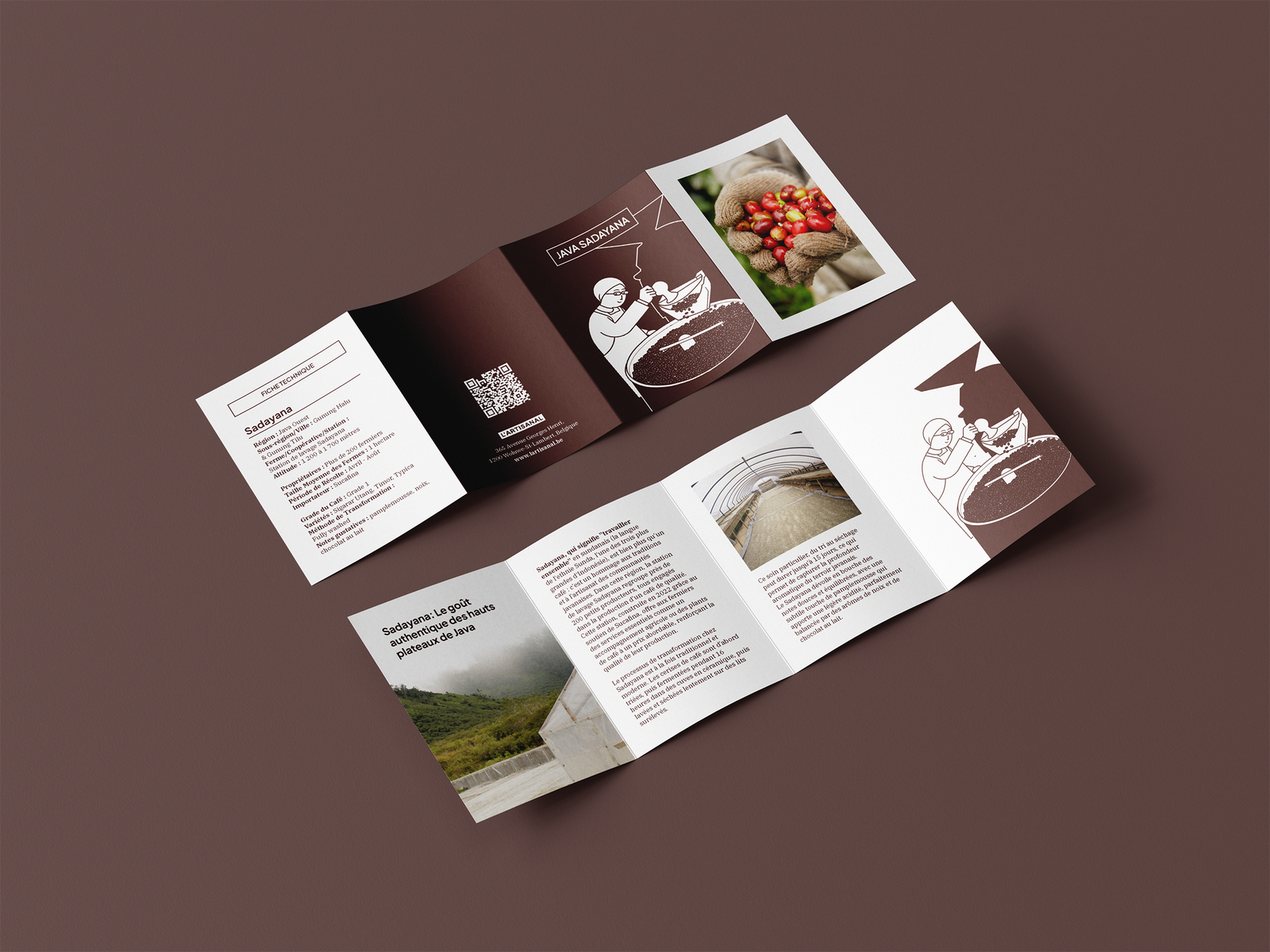
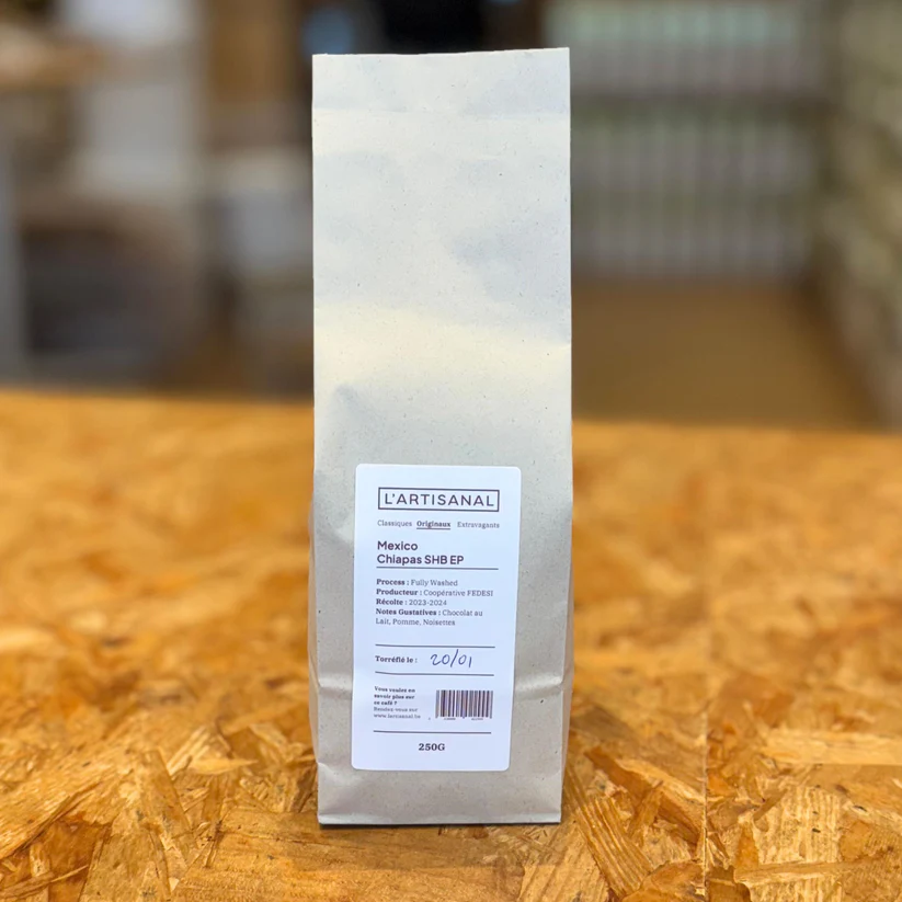
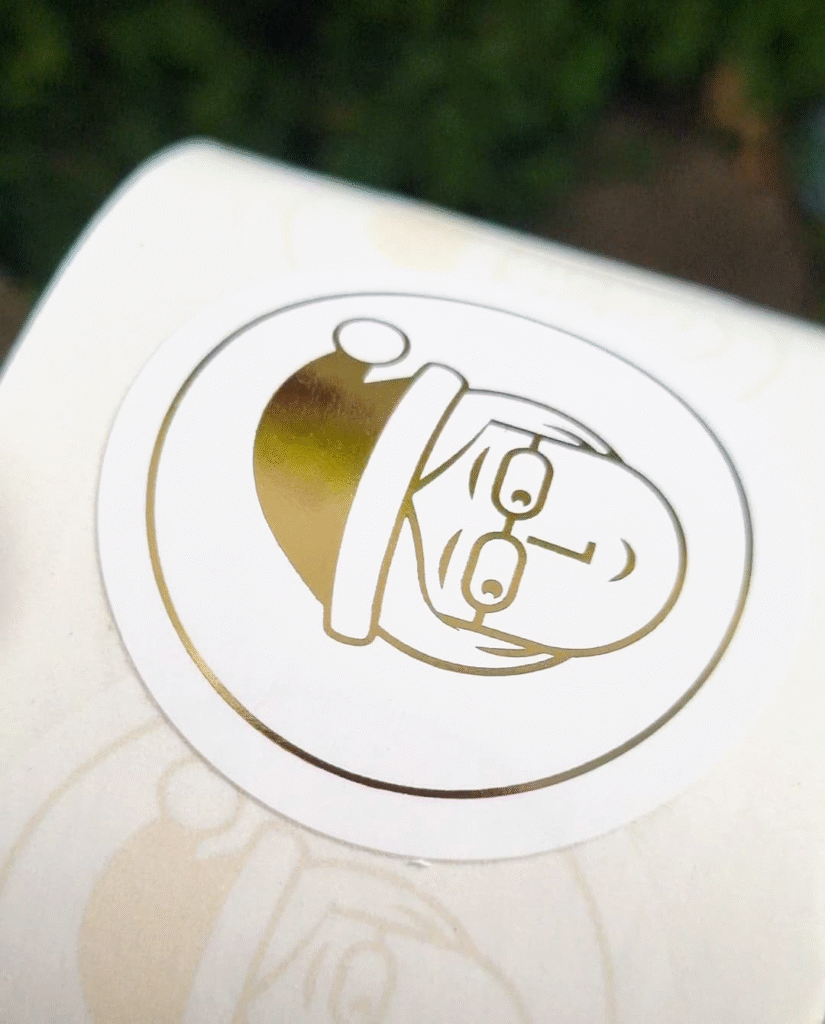
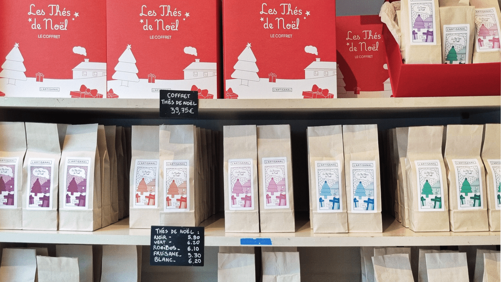
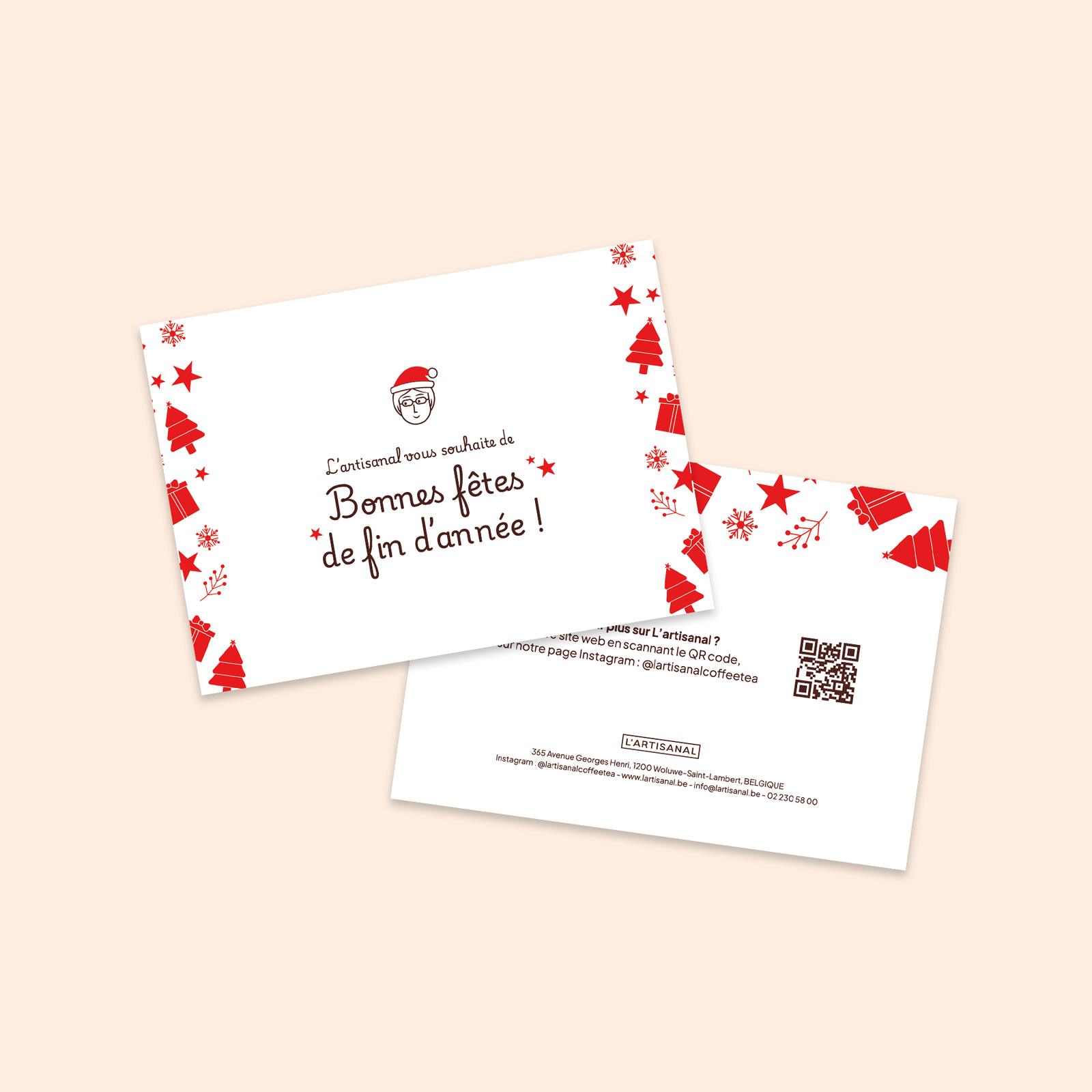
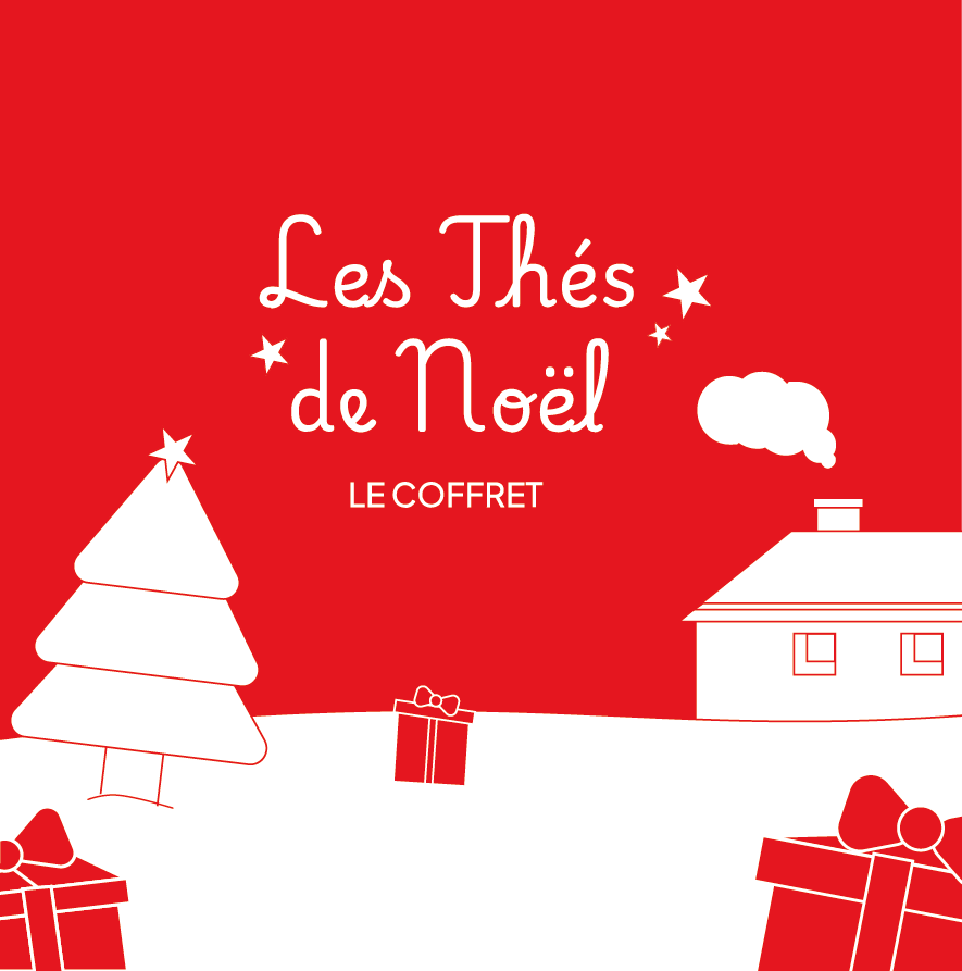
Result
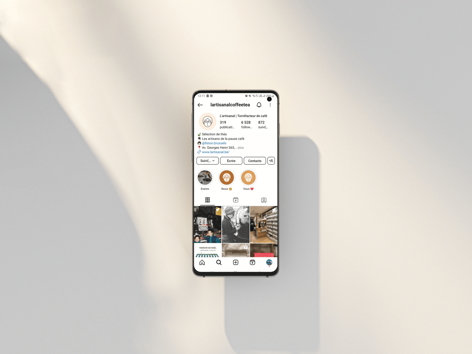
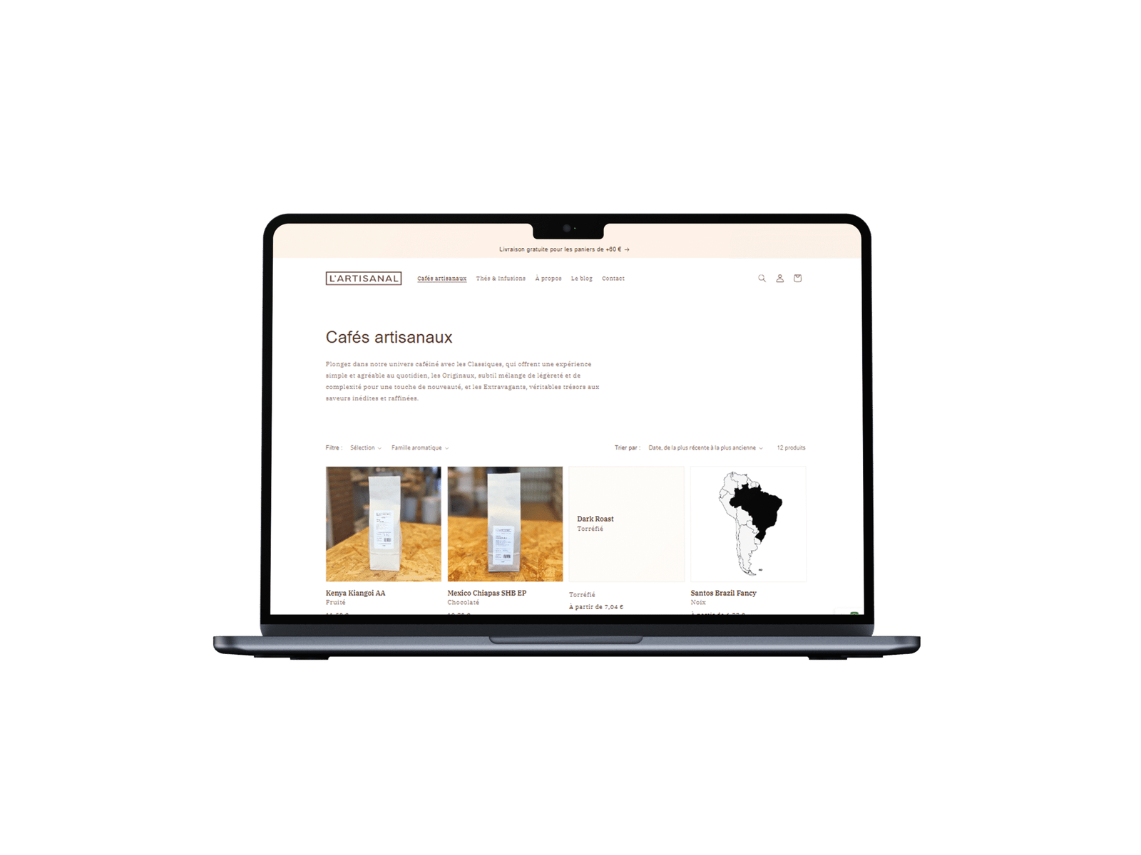
With this new brand identity, L’artisanal has been able to clarify its message, bring consistency to its branding and highlight its values. The addition of the illustration certainly adds value, helping the brand to stand out in this competitive market. Today, L’artisanal is a must-visit shop on Avenue Georges Henri in Wolluwe, thanks to its welcoming atmosphere and the quality of its products. You can find them on Instagram @lartisanalcoffeetea
Did you enjoy this project?
If you liked this graphic design for a café, you might also like the visual identity I created for Fiston bakery on the same street, where delicious croissants and pain au chocolat are served alongside coffee roasted at L’artisanal. At Fiston, the style is more understated, elegant and refined.