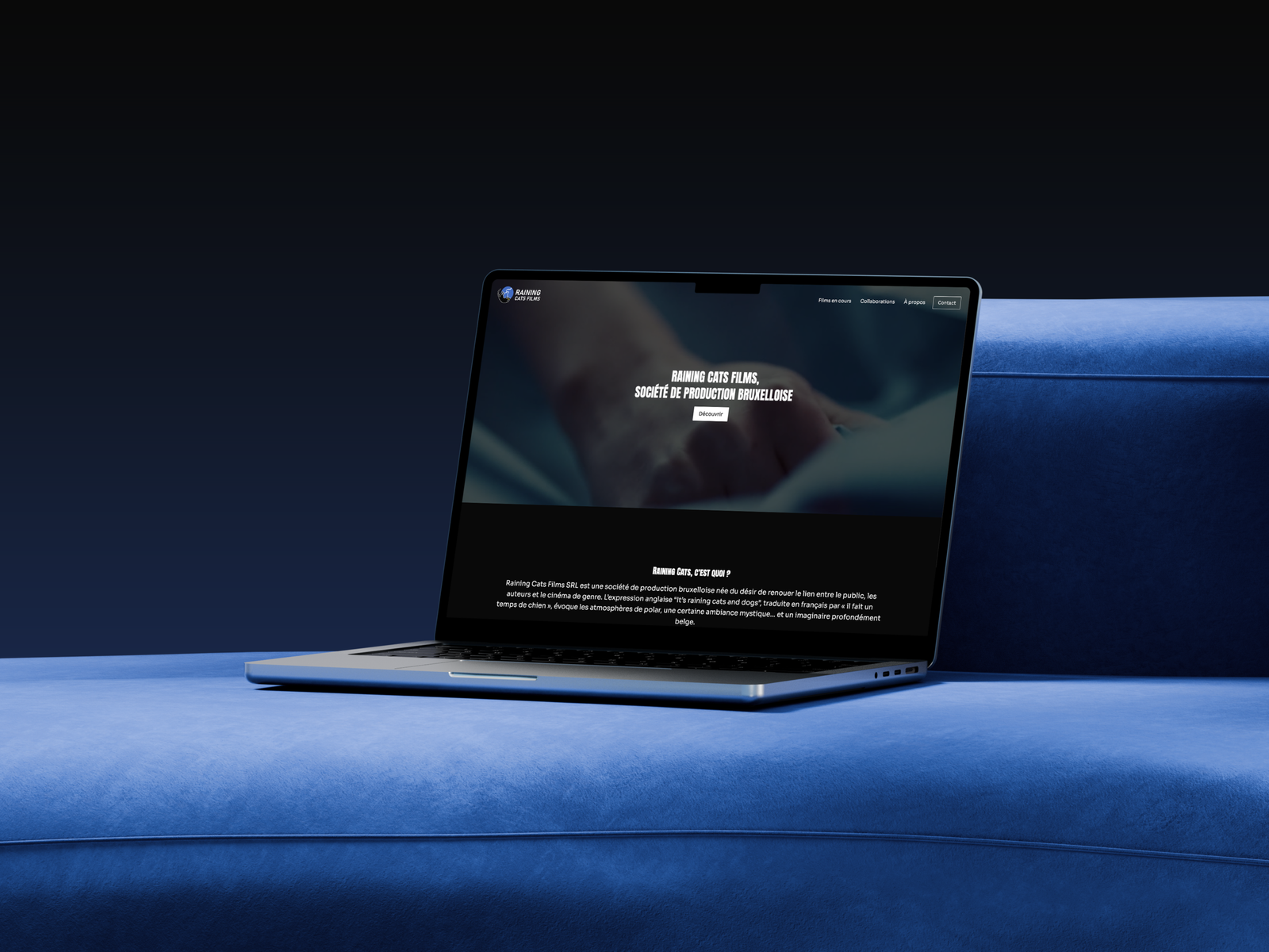
Raining Cats Films: website creation
Belgian audiovisual production company
Raining Cats Films is a Brussels-based audiovisual production company specialising in short films, documentaries and music videos. Founded on a desire to combine the legacy of Belgian cinema with the conventions of genre cinema, the company produces its films in accordance with a renewed approach to production that respects everyone’s work and takes climate issues seriously, whilst supporting the emergence of new talent.
Time Period
2026
Mission
Webdesign
Website building
Kind of project
Freelance
Tools
WordPress, Figma
Illustrator
Brief and challenge
The brief is to design a showcase website for the studio, aimed at ensuring its visibility, attracting investors and promoting its film productions. As a web designer specialising in WordPress website creation, my role is to create a seamless, intuitive user experience that is perfectly tailored to the target audience’s expectations.
1. Designing the website
Define the target audience
In order to design the website effectively, it is important to know who the target audience is.

Investors

Audiovisual professions

Competitions and festivals
Competitive analysis
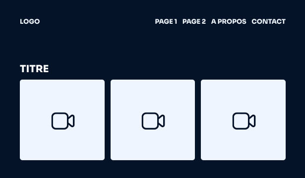
On the websites of Raining Cats Films’ direct competitors, we see a common ‘showcase’ site structure, featuring a minimalist design and large, eye-catching images.
Define the site architecture
Tree-structure
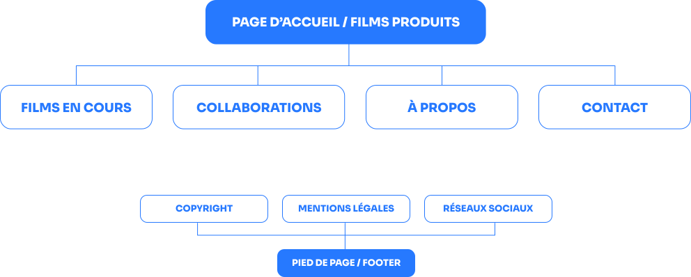
I propose a simple, linear structure, much like a portfolio. The challenge is to strike the right balance between the richness
of the audiovisual content and the site’s performance, in order to ensure a seamless experience and optimised loading times.
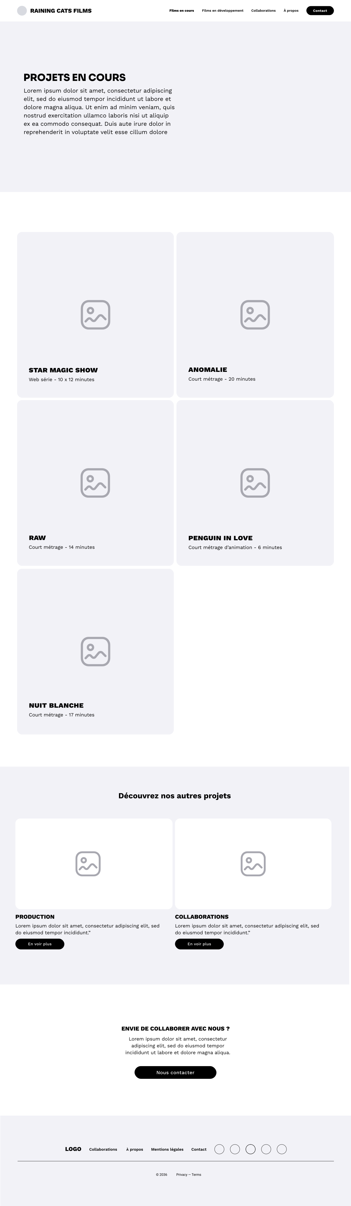
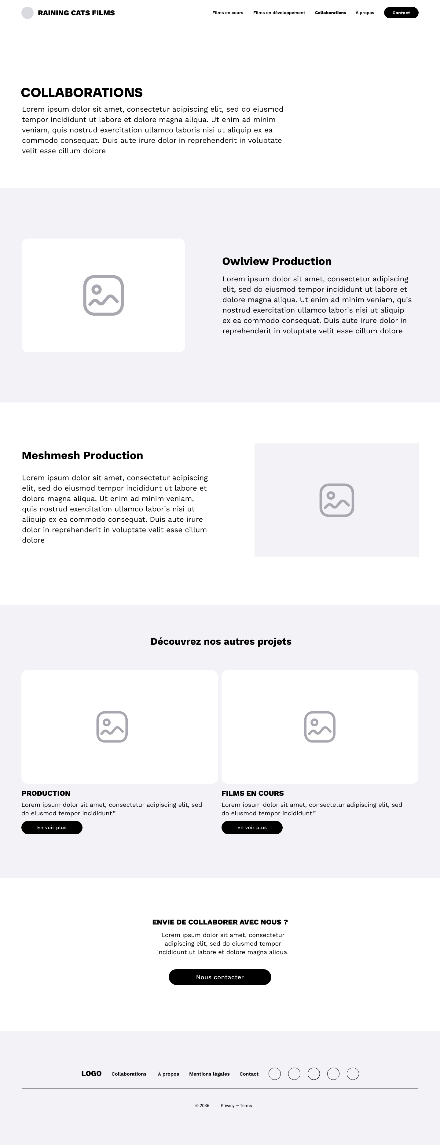
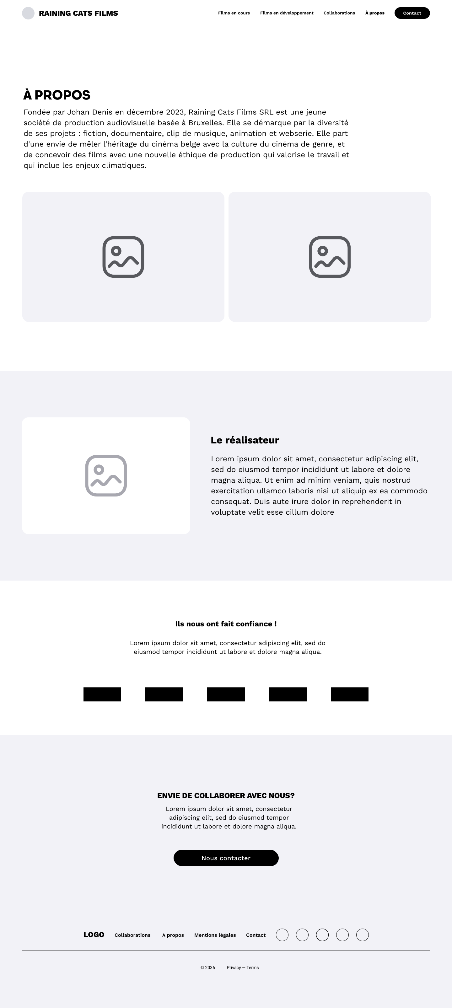
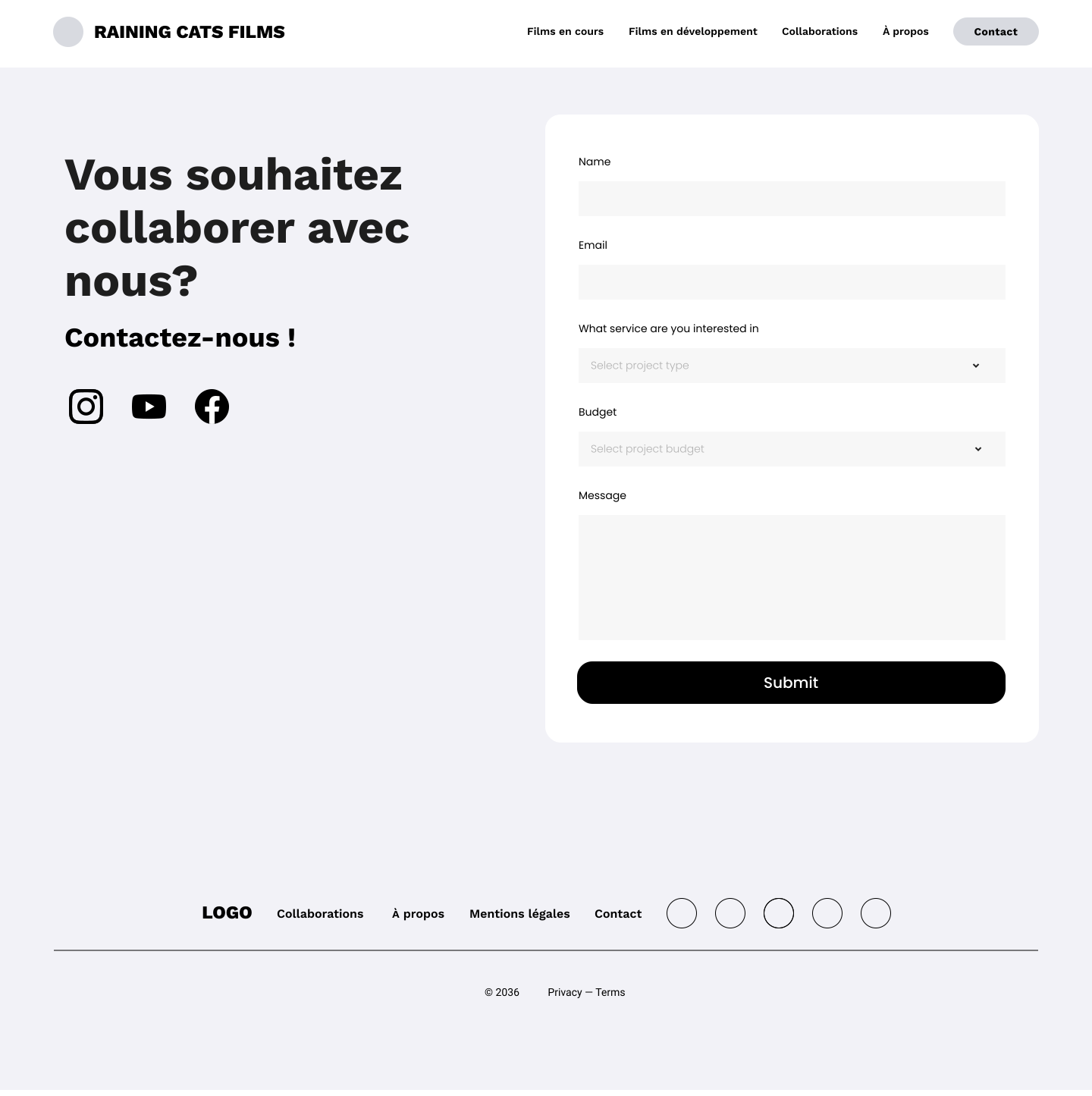
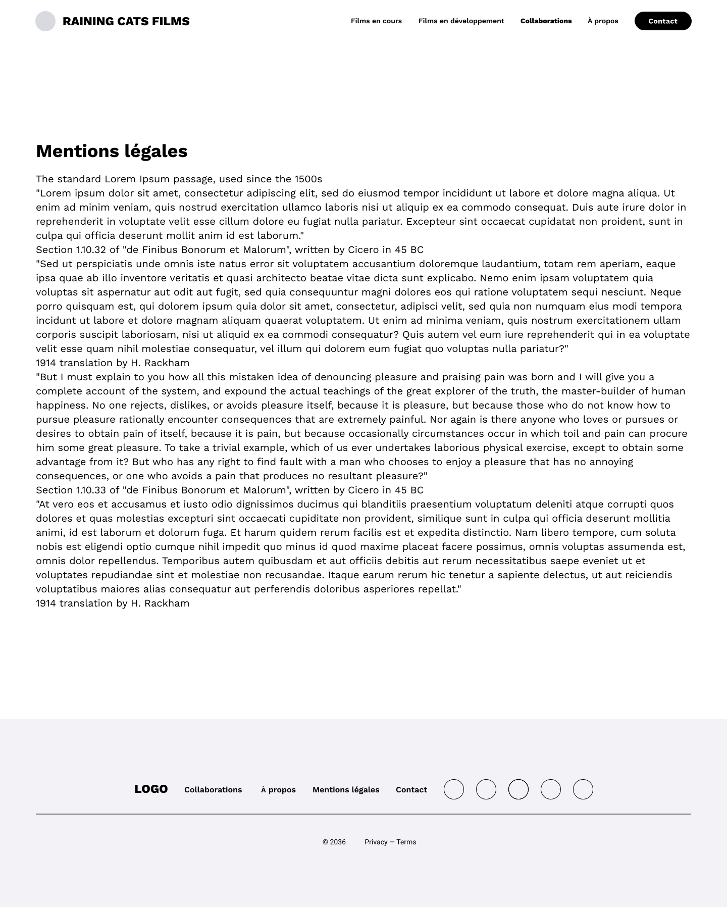
Wireframe
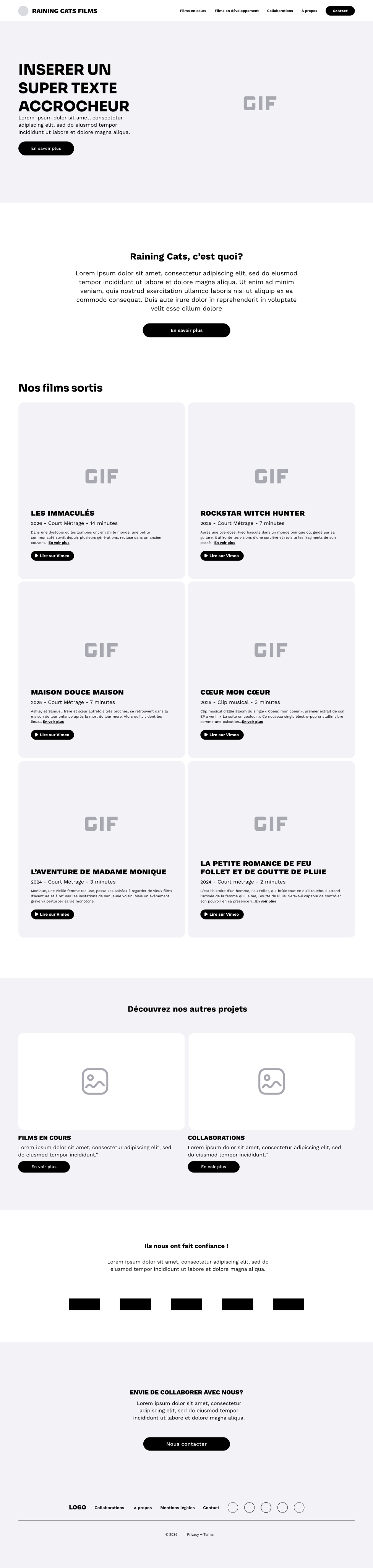
I then create the site’s structure (shown here for desktop) as well as for mobile and tablet. After several rounds of feedback, we finalise the version with the client, and we can get started on the design.
Challenge in the user journey:
the case of the homepage gallery

Objectives
- Streamline the website visually and technically:
- The films are presented in a gallery format;
- They do not have their own pages: all information must therefore be included on the home page.
- Each image in the gallery links to an external video.
ISSUES
How can we include all the descriptive content for each film on the home page?
First idea
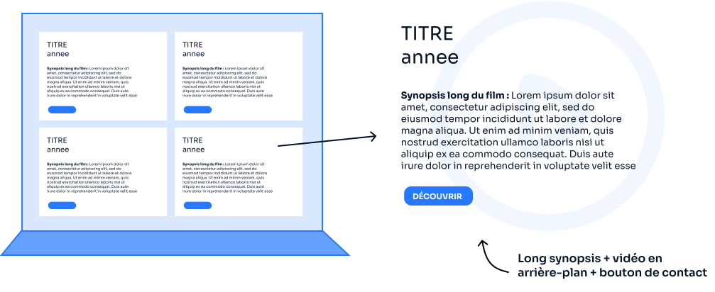
Why isn’t this approach working?
New idea
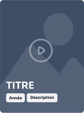
normal STATE
Synopsis: The synopsis is hidden by default. This streamlines the initial preview and highlights the image.
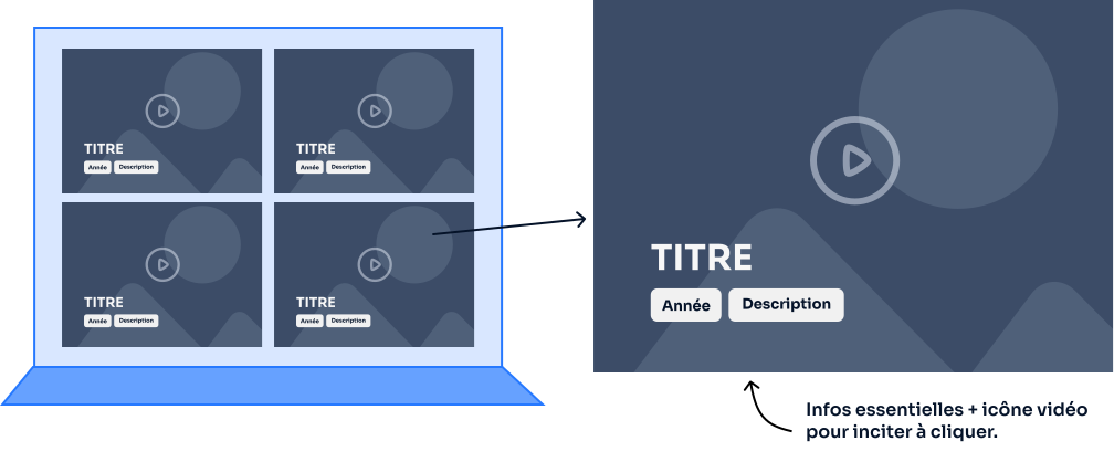
Icon: Instead of a video on a white background, which would be too cumbersome, I’ve added a play icon to indicate that there’s a video when you click. The entire area is clickable for ease of use.
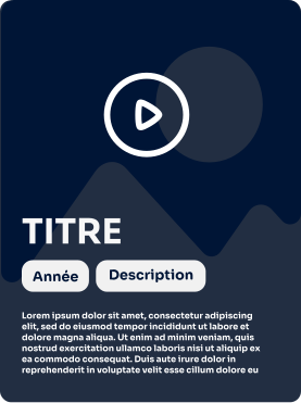
HOVER
Synopsis: the synopsis appears only when you hover over it, along with all the additional information.
Icon: the button becomes more opaque, making it stand out more.
It emphasises that it can be clicked. The icon moves up to reveal the text.
Background: the background image has been darkened slightly to make the text of the synopsis stand out more clearly.
cliCKED
Redirect to the Vimeo or YouTube links for the video.
Why does this approach actually work?
And what about on a mobile?
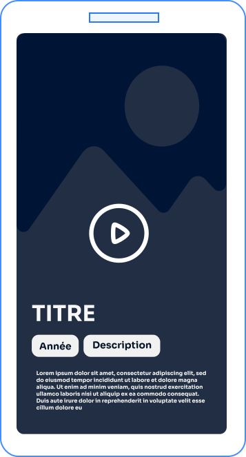
On the phone
We’re keeping the default synopsis as the tooltip isn’t ideal.
We’re enlarging the image area. As the films appear one after the other, there isn’t the same visual clutter as on a computer, where the images are displayed three at a time. Website design requires a responsive version.
Result
2. Design the website
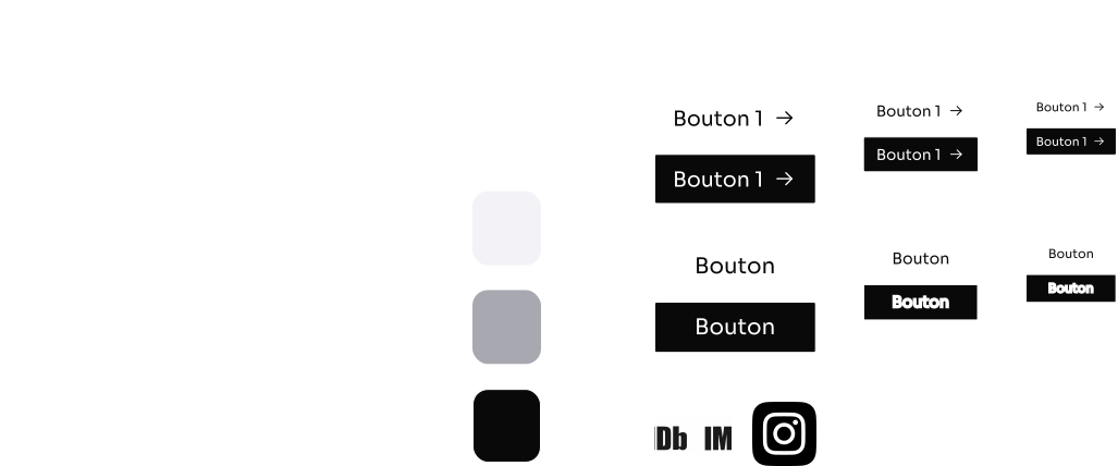
The client had a logo but no brand guidelines. After analysing the competition, we opted for a clean, modern aesthetic: a black background with bold white typography. This approach is more appropriate for a website than for print.

Responsive design
In Figma, I create mock-ups for computers, tablets and mobile phones. The layout has been adapted for each type of screen.


3. Building the website on WordPress
Choosing a web host and domain name
It’s important to choose your web host and domain name carefully. I’d recommend Hostinger for building a website; they’re well-known, ensure good search engine visibility for their sites, and have an intuitive user interface.
The steps involved in WordPress integration

Setting up the WordPress site;

Installation of the various security plugins;

Setting up the WordPress site;

Integration of the website’s visual identity;

Design of all pages for computers, tablets and mobile phones;

Inclusion of text and media content provided by the client;

Added some custom CSS to ensure it matches the Figma mock-up as closely as possible.
4. Submit the website for indexing
The client did not wish to invest in SEO at this stage, but a number of best practices were put in place beforehand:
5. The last steps

tests
A week was spent on testing: checking how the site displayed in browsers and verifying its responsiveness across different interfaces.

Delivery
Delivery of a protected document with access details. The website has been completed.

Formation
A one-hour training session, either in person or via video call, is provided to teach the client how to use their website.

Maintenance
A maintenance window is recommended over the next two months to rectify any post-launch issues.
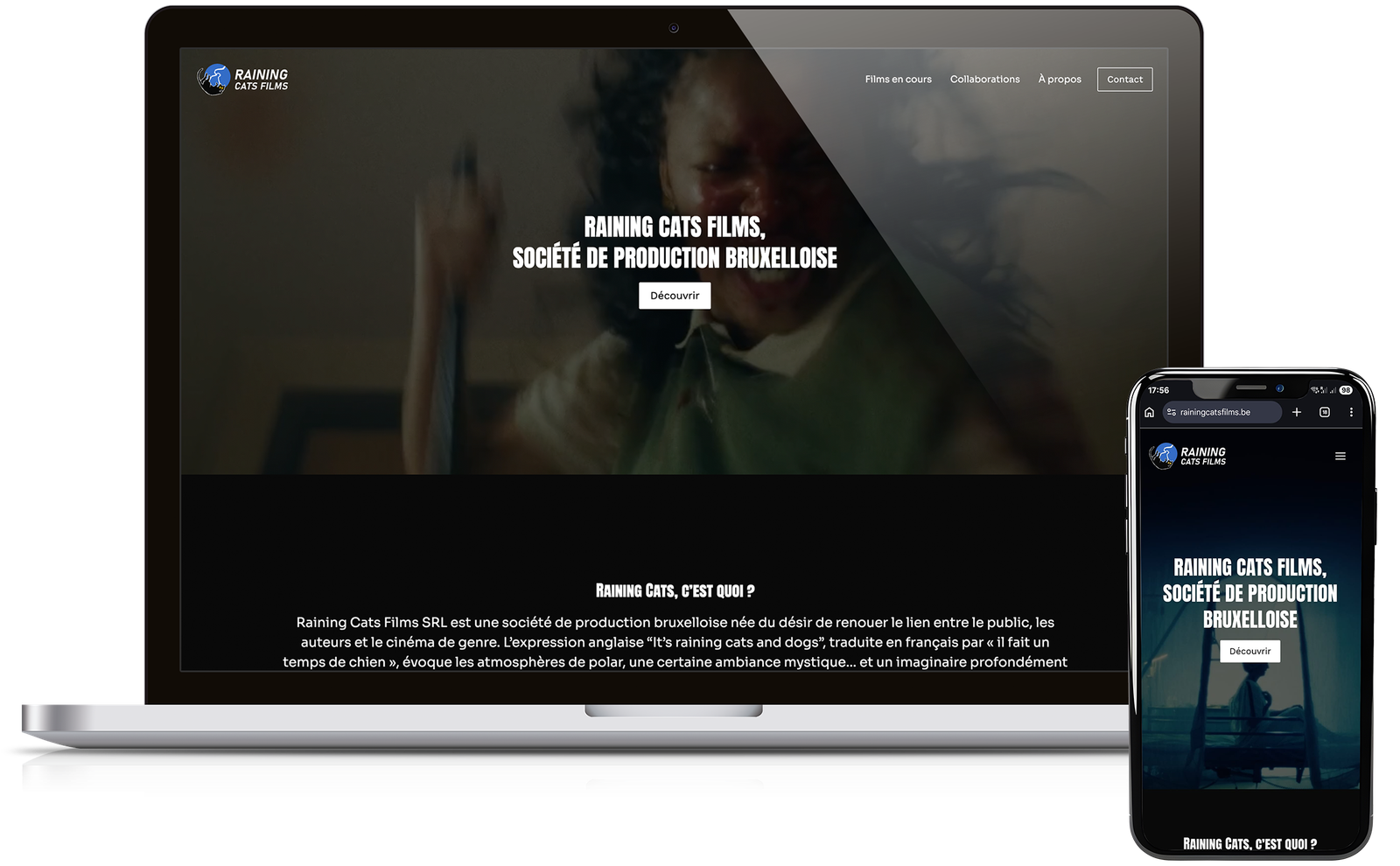
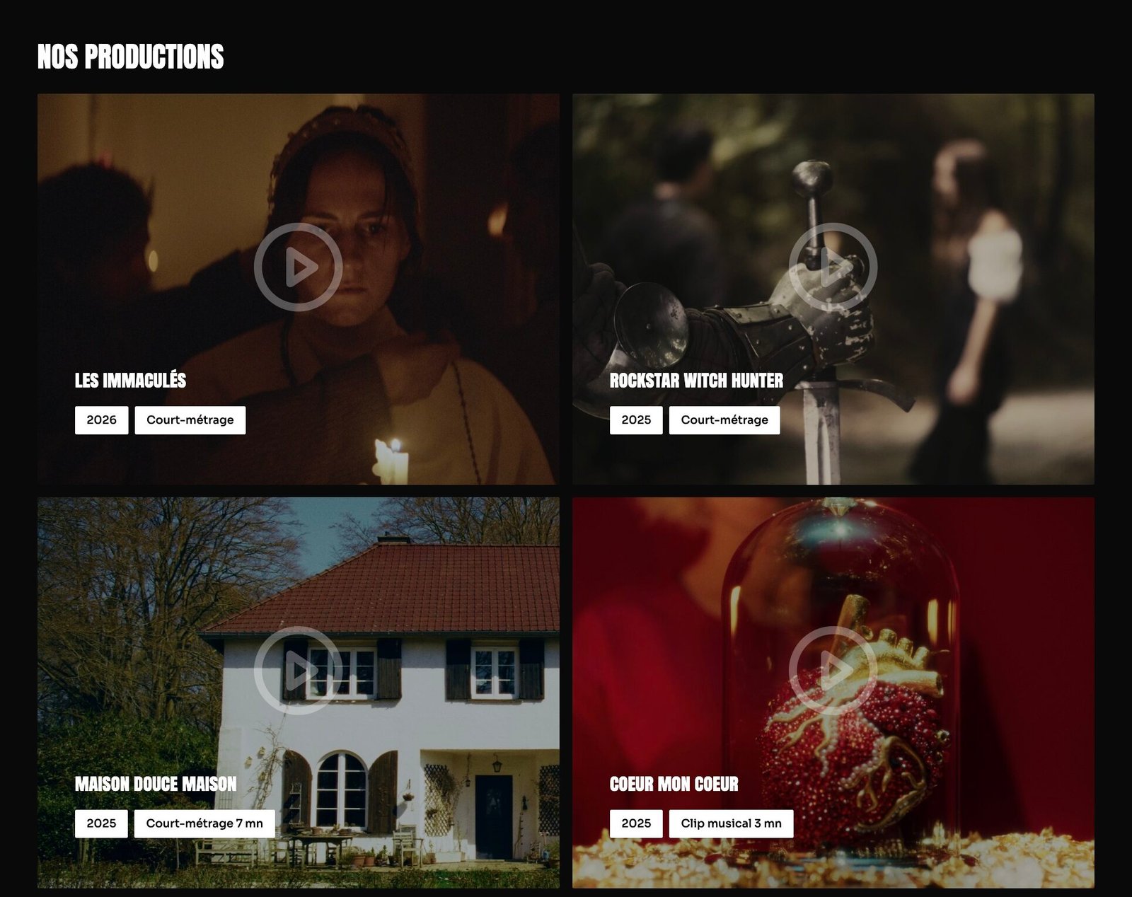
Final result
Conclusion
Two major challenges characterised this project:
And the client ?
The client was very pleased with the website: the digital transformation of their business makes it easier to connect with other professionals in the film industry. Furthermore, it enhances their company’s expertise and brand image, whilst offering a modern and elegant online portfolio. Creating a website remains a key step in a business’s digital transformation.
Did you like this project?
If you enjoyed this website creation, you might like the work I’ve done for the ‘Cinésprit’ film club.